NOAA
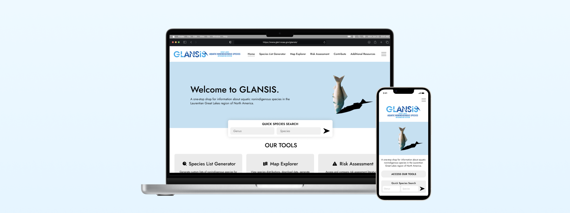
Redesign of Great Lakes Aquatic Nonindigenous Species Information System (GLANSIS) to improve the usability of the Species List Generator tool.
Role: UX Designer
Client: National Oceanic and Atmospheric Administration (NOAA)
Tools: Figma
Duration: September - December 2023 (4 weeks)
Many researchers, managers, and educators rely on NOAA’s Great Lakes Aquatic Nonindigenous Species Information System (GLANSIS) as a vital source for accessing a wide range of information on nonindigenous species. However, the current format of GLANSIS’s Species List Generator is cluttered and complex, posing challenges for user access and impeding effective efforts to mitigate the effects of invasive species.
During the fall term of 2023, I collaborated with NOAA to enhance this platform by redesigning its user interface. The goal was to simplify and declutter the structure of the site, ensuring that users can seamlessly navigate the tool and easily access comprehensive species profiles.
Problem Overview
UNDERSTANDING THE PROBLEM
Analyzing the Existing Website
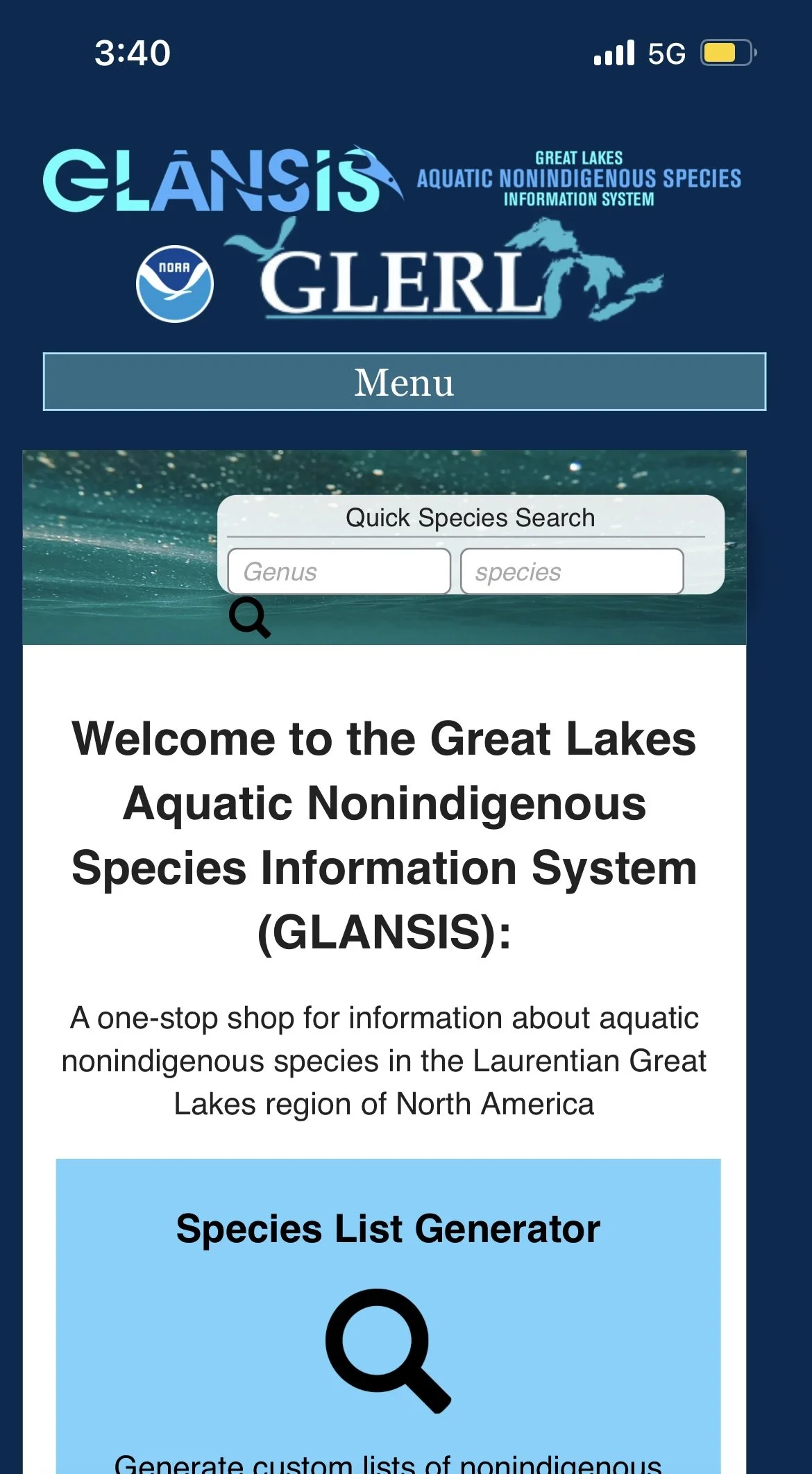
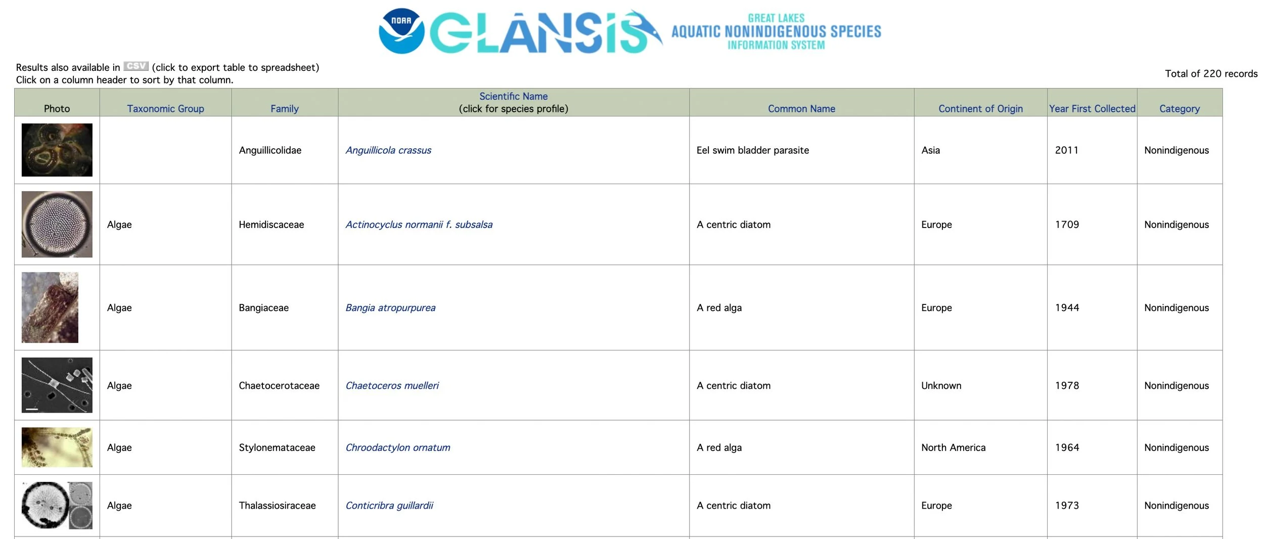
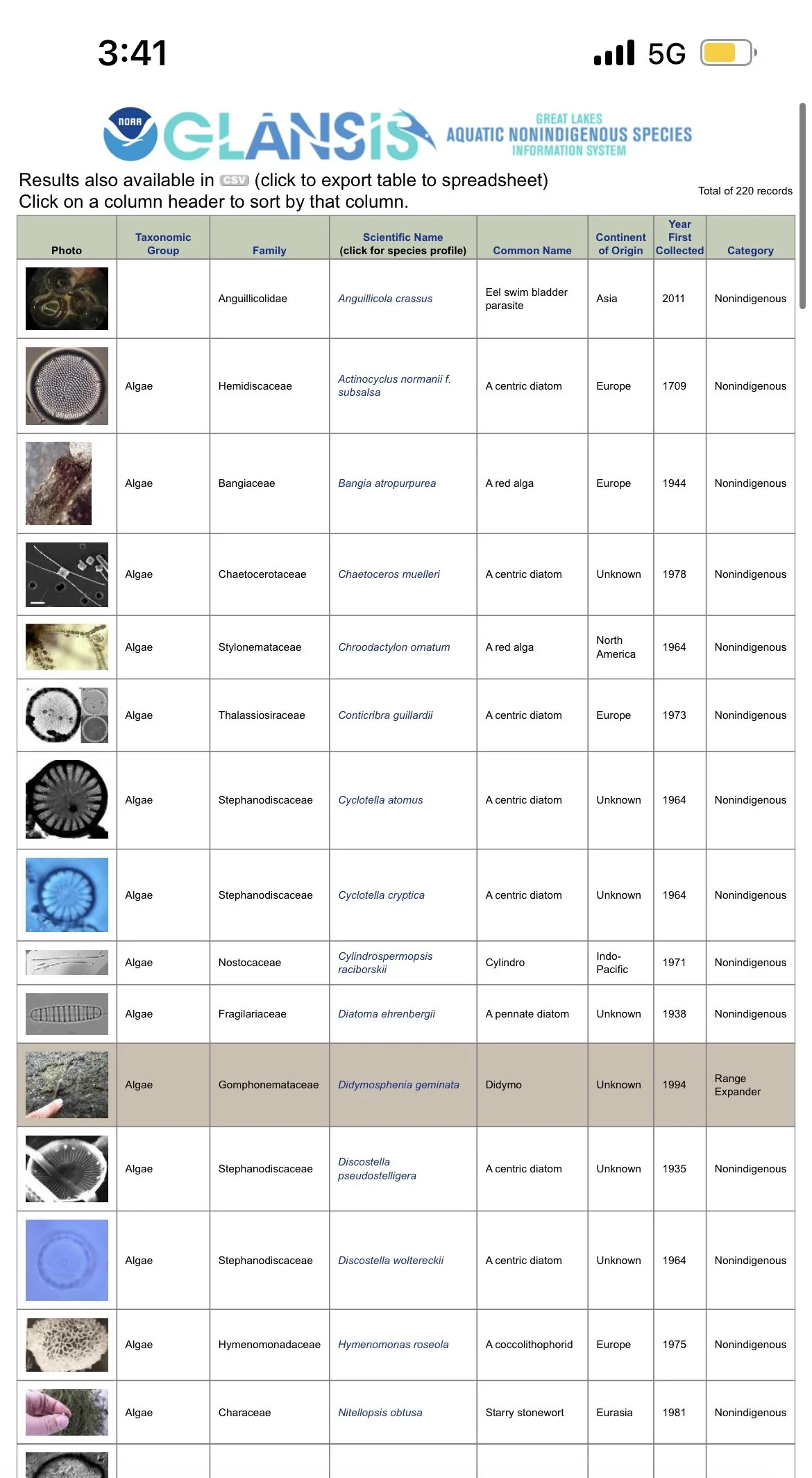
HomepageSearch ResultsUpon looking over the current site, there are some notable key issues that caught my attention.
Outdated Style: It is evident that the website has not undergone visual updates since the early 2000s, lacking a cohesive design system to maintain consistency across its pages.
Information Overload: The organization appears cluttered, overwhelmed with an abundance of search results and text on the screen simultaneously. This is especially prominent in the search results, making it difficult for users to discern and differentiate between the various results.
Hidden Key Feature: Important features, such as the quick species search, are challenging to locate on the homepage. The current design fails to prioritize its accessibility and prominence, hindering users from efficiently utilizing this key functionality.
Dr. Rochelle Sturtevant, a representative from NOAA GLANSIS, delivered a presentation highlighting diverse use cases for the website:
State/Federal manager tasked with evaluating and approving a permit request to import a species.
Resource manager seeking information on invasive species present in their management area, with a focus on identifying species that require control measures.
Researcher strategizing a project to experimentally examine a hypothesis concerning the food web within a specific habitat.
Science teacher seeking a lesson for their 8th-grade students about ecosystems and needs an age-appropriate video to enhance the lesson.
Fourth-grade student assigned to write a paper focusing on a nearby invasive species.
The primary user groups identified were field managers, researchers, and individuals in academia. Therefore, the tool must be intuitive to cater to the diverse needs of these users.
User Scenarios
DESIGNING A SOLUTION
Initial Wireframes
Instructor Feedback
I began the design process by prototyping design elements and fixes for the mobile view, based on the key issues I had identified earlier. Throughout the development process, I actively sought input from my class instructors and peers to gather diverse perspectives on which features to emphasize or remove. Their feedback led to recommendations such as increasing button sizes, ensuring coherence in icons and font sizes, and incorporating interactivity into specific elements, such as a photo pop-up feature that allows users to zoom into pictures for a more detailed view.
After submitting these mid-fidelity wireframes to my instructors for review, I received predominantly positive feedback on my design. They noted that my new structure and format of pages were very intuitive, representing a significant improvement over the existing design.The minor suggestions they offered mainly pertained to refining details such as ensuring consistency in fonts, icons, buttons, and alignment.
- inconsistent spacing
- images cropped out
- some elements do not go all the way to the end of the columns
- dropdown arrow directions reversed
- font size less than 14px (too small for mobile view)

THE FINAL DESIGN
Key Design Decision #1
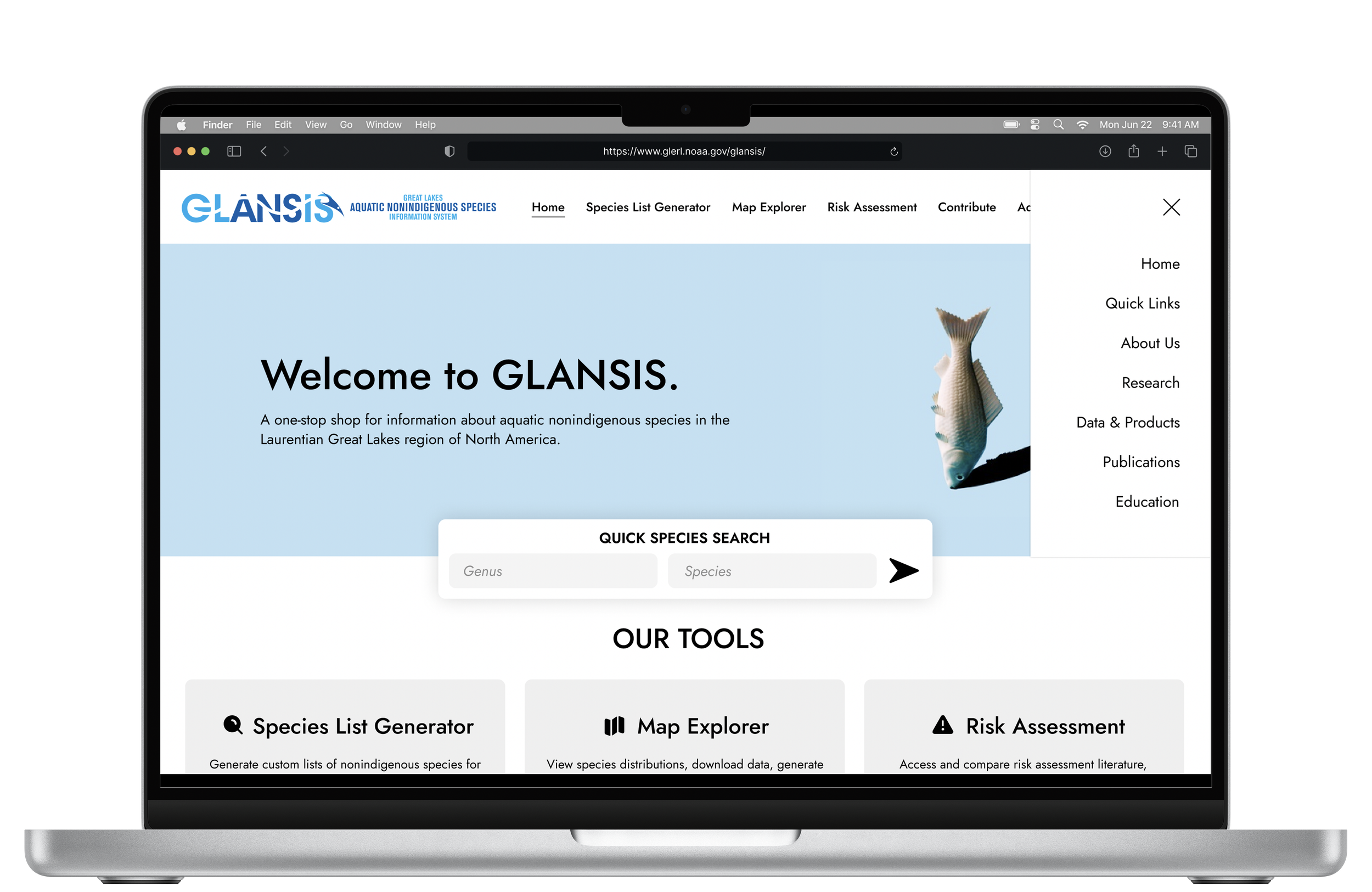
Hamburger Menu.
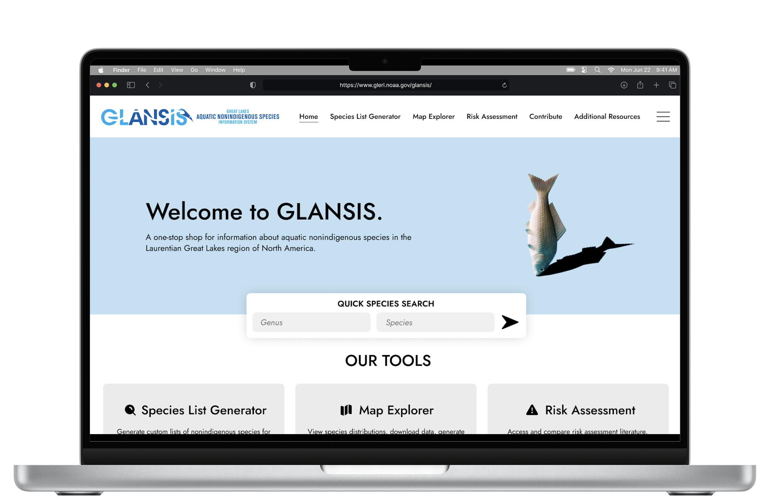
In an effort to streamline the navigation, I opted to incorporate a hamburger menu that houses the more general pages less relevant to the GLANSIS tool. This simplifies the decision-making process for users, directing their attention to the primary purpose of the tool without overwhelming them with unnecessary details.
Additionally, the hamburger menu aligns with current UX design trends, providing a familiar and user-friendly interface element. This design choice enables users to anticipate where to find additional, non-tool-specific information, contributing to a more cohesive and predictable navigation experience.
Key Design Decision #2
Enhance Visibility of Key Feature.
In my comprehensive redesign of the homepage's visual presentation, I prioritized enhancing the visibility of the Quick Species Search, a feature identified by the client as crucial to the site. Rather than having it tucked away in a corner and easily overlooked, I elevated its prominence by placing it at the center of both the desktop and mobile views. This modification is aimed at boosting user engagement and simplifying the search process, especially for individuals looking to do a quick species lookup. By ensuring that this key feature is front and center, users are more likely to notice and utilize it, contributing to an improved overall user experience.
Key Design Decision #3
Declutter & Optimize Search Results.
To address the clutter and information overload observed earlier, I opted for a user-friendly approach in presenting search results. Instead of a comprehensive grid layout, I designed simple card-like columns to represent each option. This modification offers users a clearer and less overwhelming way to view all the results, allowing them to focus on one section at a time by chunking the information.
Additionally, I introduced a “Sorting Options” menu to enable users to organize search results based on essential criteria. This ensures a straightforward experience that presents a more manageable set of results at once.
SEARCH RESULTSHomepageHomepageLearnings
Designing for real clients.
Through this project, I’ve learned that understanding the end-users and their needs is a central aspect of designing for a real client. Conducting user research and incorporating client-provided insights into the design process can enhance the chances of creating a product that resonates with the target audience.
Working with an actual client linked to a scientific research database brought an extra level of complexity to the design process. A key lesson was the importance of grasping the intricate details and specific needs of scientific research. This includes diving into the nuances of data representation and ensuring that the design not only matches the client's vision but also effectively conveys essential scientific information.


